Orbita
A capture app for people who save everything and sort nothing. It files each save and turns plans into tasks.
00
problem
You save constantly. A link from a group chat, a screenshot of a flyer, a photo of a label, a thought at a red light. It lands in a camera roll, a notes app and six chat threads, and none of it comes back when you need it. Filing it properly costs more attention than the save was worth.
solution
The thesis is that filing is the app's job, not yours. You save in about two seconds from the share sheet, a screenshot or a typed line, and the destination is not your problem. Spaces hold whatever they collect, and any space can be turned into a plan laid out day by day. Sharing is per space by single-use invite, so the people you invite see that one space and nothing else. The accommodations are not a separate mode, they are the same product everyone gets: a calmer default theme for anyone who asks for one, a reading font option, a streak that disappears instead of showing a zero, and snoozing offered beside completing rather than as a consolation.
Context
Orbita started from a habit I could not fix with any app I owned. I saved things constantly, from group chats, from Safari, from my camera roll, from a thought I did not want to lose, and I sorted almost none of it. The saving was easy. The filing was the part that never happened, so the saves stopped being useful about an hour after I made them.
Every tool I tried put the filing back on me. Folders to create, tags to pick, a board to drag things into. So the design question became a single sentence: what would this app look like if the filing were the app's job, and the user's only job were to throw things in?
My Role
I designed and built Orbita end to end: the product definition, the brand, the design system, every screen, all the client code across iPhone, Android, web and a Chrome extension, the database schema and server functions, the save pipeline, the pricing and paywall, the App Store assets and the marketing site.
Every design decision had to survive being implemented by the same person that week, which pushed the product toward fewer, sturdier patterns instead of a wide surface I would never finish.
The Verb Comes From the Thing
The sharpest decision in the product is a small one. Early on, turning a save into a task gave you an empty text field and a keyboard. It tested badly in my own use: a blank field asks you to restate what you just saved, and the retyping is exactly the friction the app exists to remove.
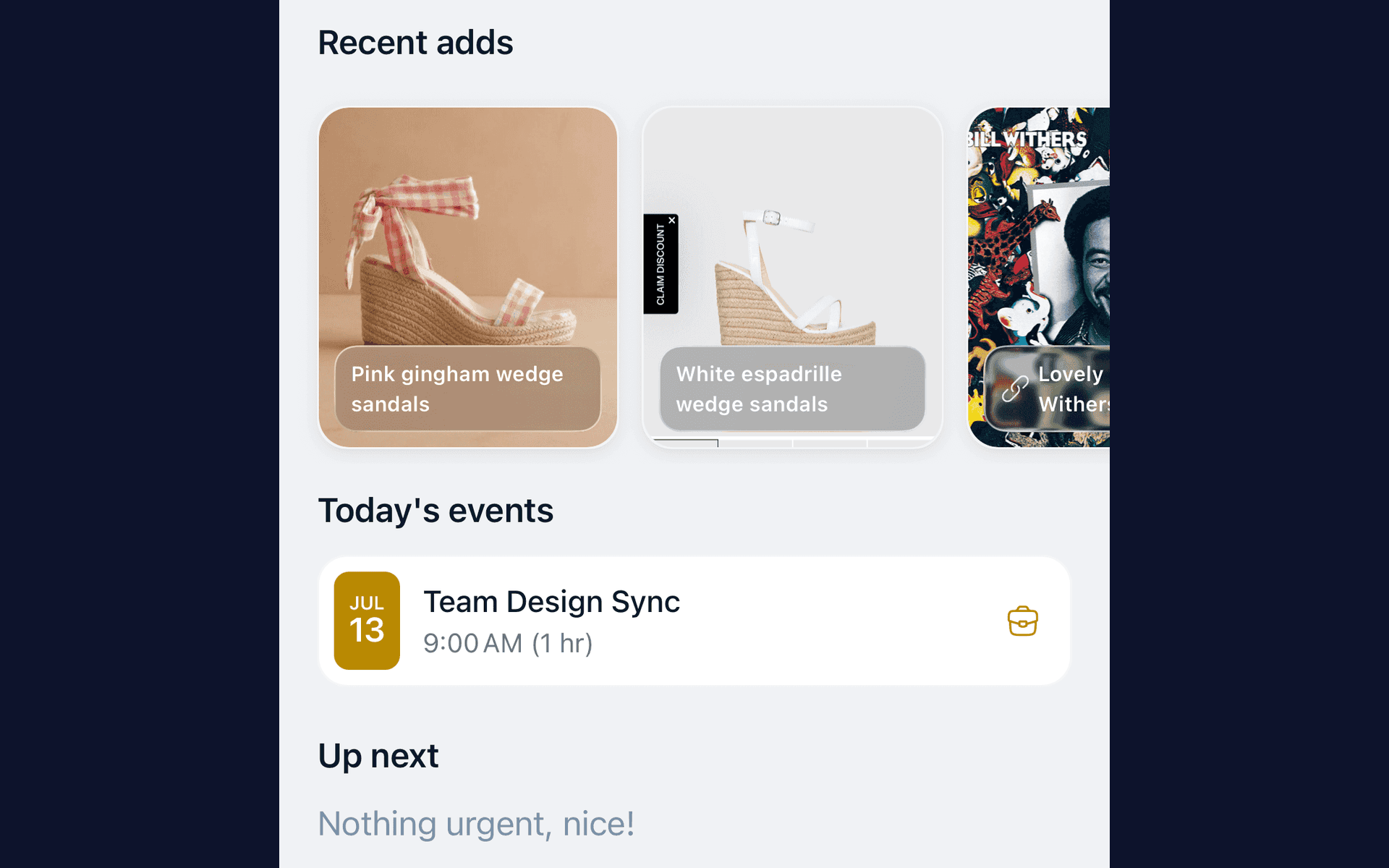
So the app now writes the verb, and the verb comes from what the thing is. A saved recipe offers Make Shakshuka. A saved book offers Read The Soul of an Octopus. A screenshot of sandals offers Buy Pink gingham wedge sandals. A podcast offers Listen to The Happiness Lab. Same gesture, same sheet, four different sentences, each already correct.
It reframed the whole capture model. The app is not storing things you will come back and process later. It is reading what you saved and proposing the next action in your own words, so the only thing left to do is confirm.
Users and Constraints
The people this is for are savers, not organizers: parents photographing school flyers, creators hoarding references, professionals capturing between meetings, students screenshotting everything. They are not going to maintain a system. Any design that assumes maintenance is already wrong for them.
Three constraints shaped the work.
This runs on a subscription, so the per-save processing cost is a hard ceiling on what the app is allowed to do every single time you save something. That constraint shaped more of the product than any design preference did.
The capture surfaces are not the app. An iOS share extension is a separate process that cannot see the app's state, and it has to feel instant, so it needs its own answer to "do I already have this?"
One person builds all of it, so a pattern only earns its place if it works on a phone screen, a browser and both platforms.
Key Insight
People do not want an organized archive. They want the thing back at the moment it matters, and they want the save to cost nothing.
That reframing is what unlocked the product. The measure of success is not how tidy the library looks. It is whether the save took two seconds, whether it landed somewhere sensible without being asked, and whether the flyer you photographed turned into the calendar entry you needed. Tidiness is the side effect, never the task.
Design Principles
Cosmic, not clinical. Depth, atmosphere and gradient light are the identity. Flat neutrals are a fallback, never the brand.
One action at a time. A single blue is the only tint for a primary action, and everything else stays neutral.
Glass over paint. Cards float on frosted surfaces instead of sitting on drop-shadowed slabs.
Quiet motion. Transitions drift like parallax. Nothing bounces for attention.
Never move the furniture. Selecting something changes its colour and never its size or border width, so nothing around it shifts.
Accessibility before decoration. AA contrast as the floor, tap targets no smaller than 44 by 44, and a font setting that includes Atkinson Hyperlegible and OpenDyslexic.
Dark is the default mood, and the dark canvas is a deep navy rather than pure black, because black kills the atmosphere the brand is built on.
Impact
Orbita reached the App Store on October 8, 2026. It is new enough that there is no meaningful adoption or retention data yet, so I would rather show the work than borrow someone else's numbers.
What did get built, measured in the codebase in September 2026: about 135,000 lines of TypeScript across four surfaces, 181 components in the mobile library, eight complete themes each with a light and a dark palette, a branching first-run onboarding assembled from fourteen steps, where the path taken depends on the answers, twenty database migrations and ten server functions, plus a native share extension written in Swift and an Android counterpart in Kotlin.
The design system is the part I would point at. Tokens live in one file and drive React Native, the web app and the written specification that design tooling reads, which is why eight themes across two modes did not turn into eight maintenance problems. The theme picker renders a live replica of the real home screen using the real components, so choosing a theme shows the actual product rather than a swatch.
Reflection / Takeaway
The lesson I keep from this one is that the hard part of an automated feature is not the mechanism, it is designing what happens when it is wrong. The decisions about what the product does when it is not sure are not backend details. They are the entire experience of trusting the thing.
Implementing it myself made that visible in a way I do not think a handoff would have. When you are the one implementing a beautiful sorting animation, you find out fast whether it was worth the two days it cost, and you spend them on the save pipeline instead.
Motion here is doing a job, not decorating. Every action gets a small, quiet confirmation, enough to register that something happened and to make the next one feel worth taking, never enough to demand attention of its own. For someone whose focus is already expensive, an interface that bounces and flashes charges a fee on every interaction. These are tuned to be mildly satisfying and immediately finished, so a long session does not leave you worn out.
One field, plain language, and the right thing comes out. Type a sentence the way you would say it out loud and the composer works out whether you meant a task, an event or a note, then fills in the fields that object needs. There is no type to pick before you start and no empty form to work through. Choosing the shape of a thing before you are allowed to write it down is what stops people who already struggle to begin, so it is the part that got removed.
Every save can become something you will actually do. Machine learning reads what you captured, works out what it actually is, and proposes the action that fits, written as a sentence you would say yourself. A two second save is already one tap from being on your list. Nothing here asks you to come back later and process a pile, because turning a save into a next action is the job this product exists to do.
The rest of the product follows from those two decisions: capture that costs one tap from wherever you already are, spaces that hold whatever they collect, and a way to find a save again once it is in.
The last two are drawings rather than screens. The first is the argument underneath the whole product. Capturing is easy, and deciding where a thing goes is the real work, because that step asks for working memory, a prediction about what your future self will search for, and a commitment to a category when no answer is the right one. That is precisely where attention differences bite, and it is the step this app removes.
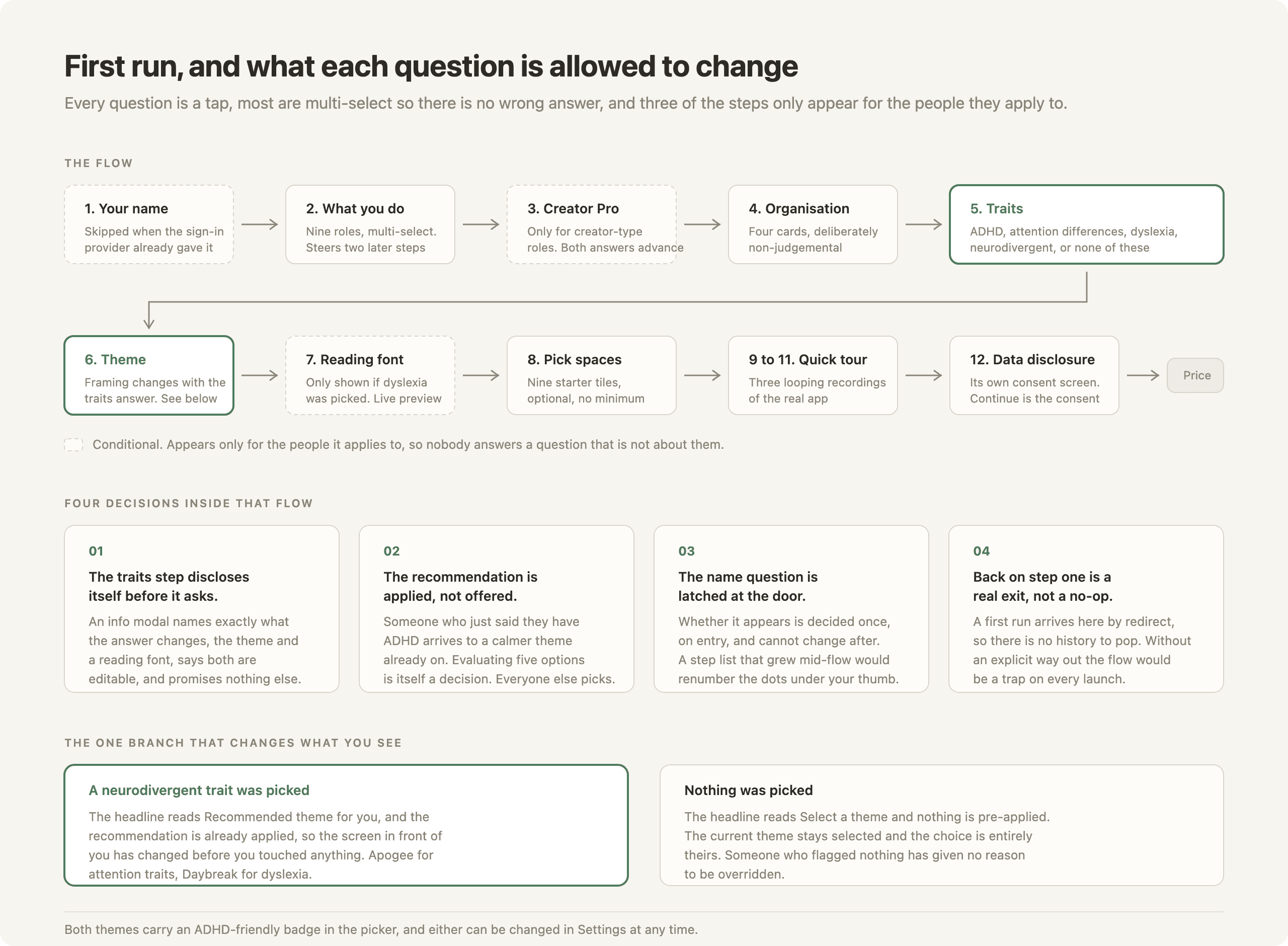
The second is the first run, and what each question is allowed to change. Saying you have ADHD preselects a calmer theme and nothing else, the step discloses that before it asks, and three of the questions never appear for the people they do not apply to. No feature sits behind a disclosure about a disability. The accommodation is not a feature bolted onto the side of the product. It is the product, and it is the same product everyone else gets.